architecture
This is the Hausman all paven and stoned, that cribbed the Cabin that never was owned that cocked his leg and hennad his Egg
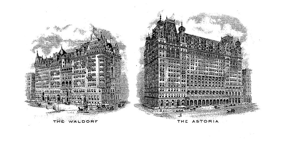
Many New Yorkers are familiar with the iconic Waldorf Astoria, which sits on Park Avenue. But they might be surprised to learn that this is the second iteration of the luxury hotel. The original was located along Manhattan’s fashionable Fifth Avenue, and the structure took up the entire block between 33rd and 34th streets. But in late November 1929 — after the stock market had crashed and the slow slide into the Great Depression began — workers began demolishing it. […] The demolition of the old hotel, completed by the winter of 1930, made way for the construction of the ultimate expression of the city’s architectural ambitions: the Empire State Building.
The original hotel started as two hotels on Fifth Avenue built by feuding relatives. The first hotel, the 13-story, 450-room Waldorf Hotel, designed by Henry Janeway Hardenbergh in the German Renaissance style, was opened on March 13, 1893, at the corner of Fifth Avenue and 33rd Street, on the site where millionaire developer William Waldorf Astor had his mansion. […]
On November 1, 1897, John Jacob Astor IV opened the 17-story Astoria Hotel on an adjacent site, and leased it to Boldt. The hotels were initially built as two separate structures, but Boldt planned the Astoria so it could be connected to the Waldorf by an alley. Peacock Alley was constructed to connect the two buildings,[21] and the hotel subsequently became known as the “Waldorf-Astoria”, the largest hotel in the world at the time.
The human technologies of utopia
New York may be a notoriously difficult place to build, but for cathedrals everywhere, delays are par for the course. In The Gothic Enterprise, author Robert Scott conducted a survey of project timelines. Construction at Canterbury Cathedral lasted 343 years. Construction at French cathedrals Amiens, Beauvais, Bourges, Evreux, Lyon, and Rouen each lasted more than three centuries. Bristol Cathedral started in 1218 and was not finished until 1905 – 688 years. Across 217 church and abbey projects in England, construction took an average of 250–300 years. And St. John the Divine is not alone among the ranks of unfinished cathedrals. Perhaps most famously, Gaudi’s Sagrada Familia has been under construction since 1882. […]
Why do cathedrals take so long to build? […]
Cathedrals are distinct from typical megaprojects in a very important way: an unfinished Cathedral is by no means a failure. […] Because the finish line is besides the point. Cathedrals are so compelling because they make visible the continued commitment that every building, city, and institution requires of their participants if they are to survive. Cathedral building ritualizes construction; they are compelling because they are never finished.
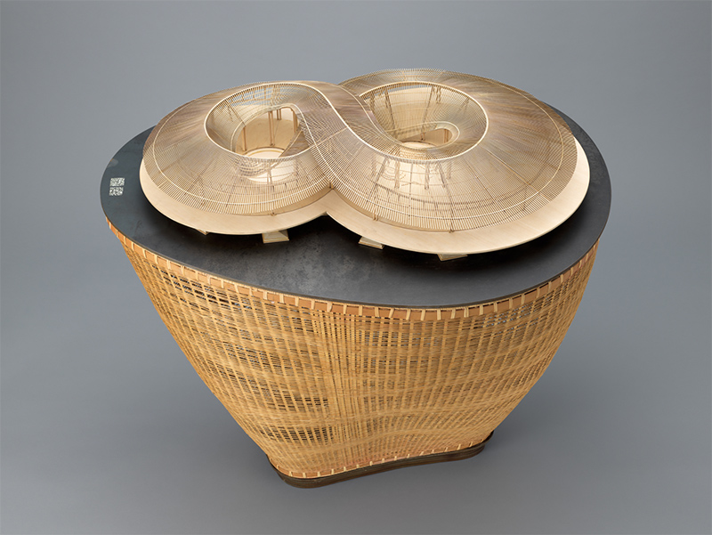
wood, steel, and bamboo { Archi-Union Architects, Philip F. Yuan, “In Bamboo” Cultural Exchange Center, Daoming, Sichuan Province, China, 2017 }
The arrival of driverless cars could help us reduce light pollution
During the period known as the High Middle Ages, between 1100-1250, the Catholic Church built over 1400 Gothic churches in the Paris Basin alone. […]
This thesis examines the implicit costs of building the Gothic churches of the Paris Basin built between 1100-1250, and attempts to estimate the percentage of the regional economy that was devoted to build them.
I estimate that over this 150-year period, on average, 21.5 percent of the regional economy was devoted to the construction of these Gothic churches, 1.5 percent of which is directly related to the implicit cost of labor.
Sea, sea! Here, weir, reach, island, bridge.

Floating bridges do not work in all cases because they are susceptible to harsh weather conditions such as strong waves and currents. This is where the floating tunnels come in. […]
The term “floating” is perhaps misleading. The tunnels are fixed in position with cables — either anchored to the seabed or tethered to pontoons which are spaced far enough apart to allow boats to pass through. Made of concrete, they would function like conventional tunnels. […]
The biggest risks in the project are explosions, fire and overloading. […] Results so far indicate that the constant water pressure that surrounds the floating tunnels reduces the damage caused by explosions. […]
the NPRA team is also investigating how the tunnels would fare if submarines crashed into them.
still { Akira Kurosawa, Rashomon, 1950 }
Ones propsperups treed, now stohong baroque
The cost of building the world’s skinniest skyscraper has ballooned so enormously that the 111 W. 57th St. project is facing imminent foreclosure while it’s less than one-quarter complete.
The 82-story skyscraper has risen fewer than 20 stories and is $50 million over budget.
[…]
“Apparently they omitted some very significant items in their budget including cranes, which are very expensive in New York and can run into the millions of dollars”
Never know who you’re talking to. Corny Kelleher he has Harvey Duff in his eye.
As the 14th edition of the Venice Biennale of Architecture prepares to open, the pavilions of the Giardini might be the perfect venue for an analysis of the architectural manifestations of national identity.
Here is a series of buildings each attempting to say something serious and legible about the nation that built them. They represent extremes of hubris, humility and hope. There are buildings here by the masters of modernism, Alvar Aalto, Carlo Scarpa, Gerrit Rietveld and Josef Hoffmann, and others by one-time names now so obscure that even historians struggle to recall them. Here is the 1938 German pavilion with its severe Nazi-era façade, the rather fey Russian pavilion designed by Aleksey Schusev, architect of the Lenin mausoleum. The British pavilion is an odd, feebly domed work by Edwin Rickards, an almost impossible space to show work in. There is the beautifully minimal Nordic pavilion by Sverre Fehn and the extraordinary maximal, green ceramic-clad Hungarian pavilion by Géza Maróti.
Each pavilion tells us about the desire to express something of the national character – and the prevailing political aesthetic. And it is this idea – and what happened to it – that is at the heart of the theme set by this year’s curator, Rem Koolhaas. The question is posed through the juxtaposition of cities a century ago – with their distinctive, bustling streetscapes, busy with architectural detail – with shots of contemporary central business districts, the anonymous cityscapes of glass towers and urban freeways that could be Houston or Dubai, La Défense or Doha. The question Koolhaas poses is: How did this happen? How did these diverse cities absorb this idea of modernity in such a homogenous way, how did one type of architecture attain such hegemony?
[…]
Koolhaas’s brilliant dissection of the meaning of the skyscraper in his 1975 book Delirious New York includes the insight that the elevator – which finally makes the long-dreamt-of skyscraper possible – also allows its expression to be disassociated from its structure. The endless extrusion no longer has any structural logic or rationale that can be expressed on the exterior; instead its architecture – its style – is now purely applied.
Koolhaas extends this idea in his 2001 essay “Junkspace”, where he indicates that out-of-town locations, air-conditioning and the escalator have finally broken any notions of architectural responsibility to context and any ties between scale and architecture. “Architecture disappeared in the 20th century,” he wrote.
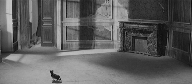
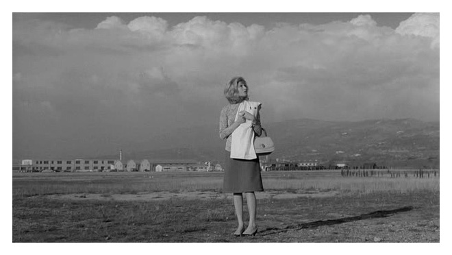
image { Michelangelo Antonioni, L’Eclisse, 1962 }
Trespassers Will. That’s short for Trespassers William.
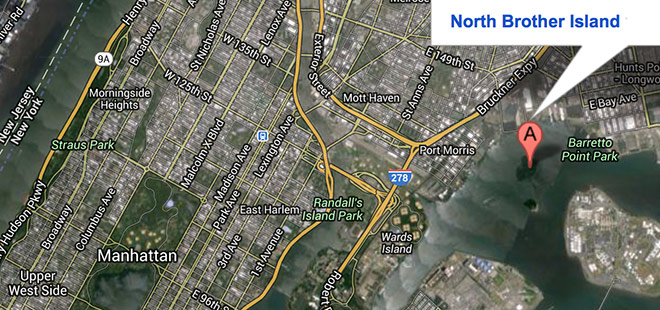
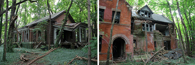

{ North Brother Island was in use by New York City from 1885 to 1963 as a hospital complex to quarantine and treat people suffering from smallpox and typhoid fever then a rehab center and a housing project for WWII vets. In the 1950s a center opened to treat adolescent drug addicts. Heroin addicts were confined to this island and locked in a room until they were clean. By the early 1960s widespread staff corruption and patient recidivism forced the facility to close. It is now uninhabited and designated as a bird sanctuary. | Rsvlts | more photos | Read more: NY Times, Wikipedia }
Tactical comparisons between void and not being there
In the late 1960s and ‘70s, working with the New York City Planning Commission, the sociologist William H. Whyte conducted groundbreaking granular studies of the city’s public spaces, spending hours filming and photographing and taking notes about how people behave in public. Where do they like to sit? Where do they like to stand? When they bump into people they know, how long do their conversations last? […]
Whyte and his acolytes formulated conclusions that were, for their time, counterintuitive. For example, he discovered that city people don’t actually like wide-open, uncluttered spaces. Despite the Modernist assumption that what harried urban people need are oases of nature in the city, if you bother to watch people, you see that they tend to prefer narrow streets, hustle and bustle, crowdedness. Build a high-rise with an acre of empty plaza around it, and the plaza may seem desolate, even dangerous. People will avoid it. If you want people to linger, he wrote, give them seating — but not just benches, which make it impossible for people to face one another. Movable chairs can be better. Also: Never cordon off a fountain.
[…]
For his dissertation at the University of Toronto, Hampton studied an extraordinary early experiment in wired living. In the mid-1990s, a consortium that included IBM and Apple helped raise more than $100 million to turn a new suburban development in Newmarket, Ontario, a Toronto suburb, into the neighborhood of the future. As houses went up, more than half of them got high-speed Internet (this in the age of dial-up), advanced browser software for their computers, a tool for videoconferencing between houses and a Napster-like tool for music sharing. He treated the other homes as a control group. From October 1997 through August 1999, Hampton lived in a basement apartment in the new development, observing and interviewing his neighbors.
Hampton found that, rather than isolating people, technology made them more connected. […] [T]hey were much more successful at addressing local problems, like speeding cars and a small spate of burglaries. They also used their Listserv to coordinate offline events, even sign-ups for a bowling league. Hampton was one of the first scholars to marshal evidence that the web might make people less atomized rather than more.
Hampton crudely summarized his former M.I.T. colleague Sherry Turkle’s book “Alone Together.” “She said: ‘You know, today, people standing at a train station, they’re all talking on their cellphones. Public spaces aren’t communal anymore. No one interacts in public spaces.’ I’m like: ‘How do you know that? We don’t know that. Compared to what? Like, three years ago?’ ”
Turkle said that her decades of observation are pretty conclusive: “When you watch a mother texting as she pushes a stroller — and I follow that mother for blocks, I walk alongside — you know it. You know that the streetscape used to include mothers who spoke to their children.”
[…]
According to Hampton, our tendency to interact with others in public has, if anything, improved since the ‘70s. The P.P.S. films showed that in 1979 about 32 percent of those visited the steps of the Met were alone; in 2010, only 24 percent were alone in the same spot. When I mentioned these results to Sherry Turkle, she said that Hampton could be right about these specific public spaces, but that technology may still have corrosive effects in the home: what it does to families at the dinner table, or in the den. Rich Ling, a mobile-phone researcher in Denmark, also noted the limitations of Hampton’s sample. “He was capturing the middle of the business day,” said Ling, who generally admires Hampton’s work. For businesspeople, “there might be a quick check, do I have an email or a text message, then get on with life.” Fourteen-year-olds might be an entirely different story.
{ NY Times | Continue reading | Thanks Jane JL! }
For instance, he proposed that the claim that a thought has a location is nonsensical
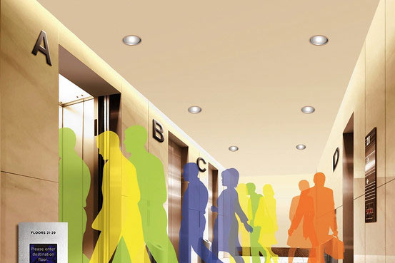
{ During the recent $550 million upgrade of the Empire State Building, Ms. Christy was asked whether she could help get more people up to the observation deck. She said she couldn’t get more people into a car but could move them up more quickly. So she increased the elevators’ speed by 20%, to 20 feet per second. Now the cars can rise 80 floors in about 48 seconds, 10 seconds faster than before. Ms. Christy strikes down one common myth—that “door close” buttons don’t work. Sometimes they do, sometimes they don’t, she says. It depends on the building’s owner. | WSJ | full story }
An escalator can never break: it can only become stairs.
Today, the near 10-year-old Academy of Neuroscience for Architecture believes that neuroscience could make science’s greatest contribution to the field of architecture since physics informed fundamental structural methods, acoustic designs, and lighting calculations in the late 19th century. […]
With today’s sophisticated brain-imaging techniques, neuroscientists can examine how the brain processes environments, even with the complex limitations of, say, someone who’s blind, or autistic, or has dementia. […]
Macagno has been testing hospital design in a virtual-reality lab, and this work could bring us closer to that elusive hospital where, for example, no one gets lost. Other findings from the kind of research he is talking about may challenge what architects have practiced for years. For instance, hospital rooms for premature babies were long built to accommodate their medical equipment and caregivers, not to promote the development of the newborns’ brains. Neuroscience research tells us that the constant noise and harsh lighting of such environments can interfere with the early development of a baby’s visual and auditory systems.
‘People know what they do; frequently they know why they do what they do; but what they don’t know is what what they do does.’ –Michel Foucault
Lean allegedly came from the Japanese manufacturing model in the 1980s and 90s, yet its governing principles, the ‘Five Ss’, are explained in Frederick Taylor’s 1911 book The Principles of Scientific Management in beautiful detail: Sort – you look at a workspace and you see what is needed for the job; everything else, pictures, food, drinks, anything apparently superfluous, you take out. Then you Set in order, so for example if somebody is right-handed you’d make sure you they were sitting in a right-handed workspace. Then Shine – you take everything off and clean – or shine – the workspace, so that managers can see that you’re doing your job and nothing else. Then you Standardize, so that if you’re in Leicester or Lima it’s the same recognizable corporate space. Then Sustain, always said to be the hardest one – keep it going. Of course Sustain is difficult if you go into a workspace and mess around with it in this way, you generate the Hawthorne effect – a quick peak of interest and then a trough of disappointment, so Sustain is hard. But the psychologically interesting thing is that people still think, ‘It must work.’
We don’t understand psychologically why putting someone in an impoverished space should work, when it doesn’t work for any other animal on the planet. Put an ant in a lean jam jar or a gorilla in a lean cage and they’re really miserable, so why should it work for people? So we started to experiment. […]
Every time we’ve experimented, we’ve found well-being and productivity have been inextricably linked. Over eight years, lean has always, without exception, been the worst condition you can put anyone into.
uʍop ǝpısdn
Over time, we have grown increasingly vulnerable to natural disasters. Each decade economic losses from such disasters more than double as people continue to build homes, businesses, and other physical infrastructure in hazardous places. Yet public policy has thus far failed to address the unique problems posed by natural disasters. […]
Drawing from philosophy, cognitive psychology, history, anthropology, and political science, this Article identifies and analyzes three categories of obstacles to disaster policy — symbolic obstacles, cognitive obstacles, and structural obstacles. The way we talk about natural disaster, the way we think about the risks of building in hazardous places, and structural aspects of American political institutions all favor development over restraint. Indeed, these forces have such strength that in most circumstances society automatically and thoughtlessly responds to natural disasters by beginning to rebuild as soon as a disaster has occurred.
photo { Ann James }
From the deep pain of having to confess again and again that you never loved as you were loved

{ The Great Pyramid, built for the Pharaoh Khufu in about 2570 B.C., sole survivor of the Seven Wonders of the ancient world, and still arguably the most mysterious structure on the planet. | Inside the Great Pyramid | Smithsonian | The Secret Doors Inside the Great Pyramid | Guardians }
The poem you live in
On a peninsula southeast of Beijing, developer Vincent Lee wants to copy New York City—literally.
Two years into its ten-year construction plan, Yujiapu is still a field of cranes, fenced along the perimeter and hazy behind the smog. The only thing that resembles New York City is a diorama in the lobby of Binhai New Area CBD Office, where bureaucrats like Vincent Lee of the Business Bureau, are working to deliver on their ambitious promise of making this 3.86 sq km area the “largest single financial center on the world.”
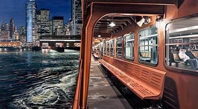
oil on board { Richard Estes, Staten Island Ferry Arriving Manhattan, 2011 }
We’re still trying to figure out the meaning of that last phrase. There’s nothing to figure out. This man is obviously a psychotic.
Recently, scientists have begun to focus on how architecture and design can influence our moods, thoughts and health. They’ve discovered that everything—from the quality of a view to the height of a ceiling, from the wall color to the furniture—shapes how we think. (…)
In 2009, psychologists at the University of British Columbia studied how the color of a background—say, the shade of an interior wall—affects performance on a variety of mental tasks. They tested 600 subjects when surrounded by red, blue or neutral colors—in both real and virtual environments.
The differences were striking. Test-takers in the red environments, were much better at skills that required accuracy and attention to detail, such as catching spelling mistakes or keeping random numbers in short-term memory.
Though people in the blue group performed worse on short-term memory tasks, they did far better on tasks requiring some imagination, such as coming up with creative uses for a brick or designing a children’s toy. In fact, subjects in the blue environment generated twice as many “creative outputs” as subjects in the red one.


