Every town I go to is like a lock without a key

A new logo for Gap that debuted to much criticism Wednesday might not be the perfect fit, Bill Chandler, vice president of corporate communications of Gap, tells Co.Design. “We love the design, but we’re open to other ideas and we want to move forward with the best logo possible,” he says.
Chandler confirmed last night’s message from Gap’s Facebook account (using the old logo as their avatar), which announced the new logo is actually part of a crowdsourcing project. He would not say when — before or after the tidal wave of criticism — Gap decided to participate in one of the most contentious practices in design, in which regular Joes and Janes compete to create a logo that’s better than the one made by a professional. The logo itself was not a PR stunt, Chandler says.
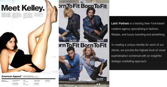
The new logo was designed by Trey Laird and his firm Laird and Partners, who have served as Gap’s creative directors for many years.
previously:

{ left to right: American Apparel ad 2005, Gap ad 2009, Laird+Partners About us page }


